Branding Case Study: LEFC
In 2019, the church I work for embarked on a new building project. The leadership felt like it was a good time for a redesign of the church branding, to coincide with the launch of the new building. The scope was large; not only would I be designing a new logo, I would be choosing overall branding that would influence paint colors, signage, and style of the building. And under the umbrella of the LEFC brand would be department logos such as Kids’ Ministry, Youth Ministry, and Adult Ministry (all of which would become LEFC Kids, LEFC Students, and LEFC Adults). It was a massive undertaking, and so I approached it slightly differently than a normal freelance branding project. I prepared a questionnaire for the leadership to dial in to how much we wanted to change about the brand and what they felt was the most important parts of the church’s identity. I used these questionnaires to start my design iteration process.
The process
-
![]()
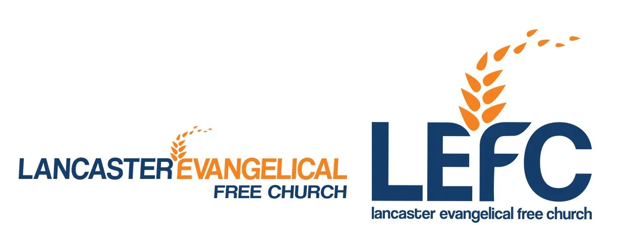
Previous Logo
This was our starting point. We’d had the orange and blue even before this logo was implemented.
-
![]()
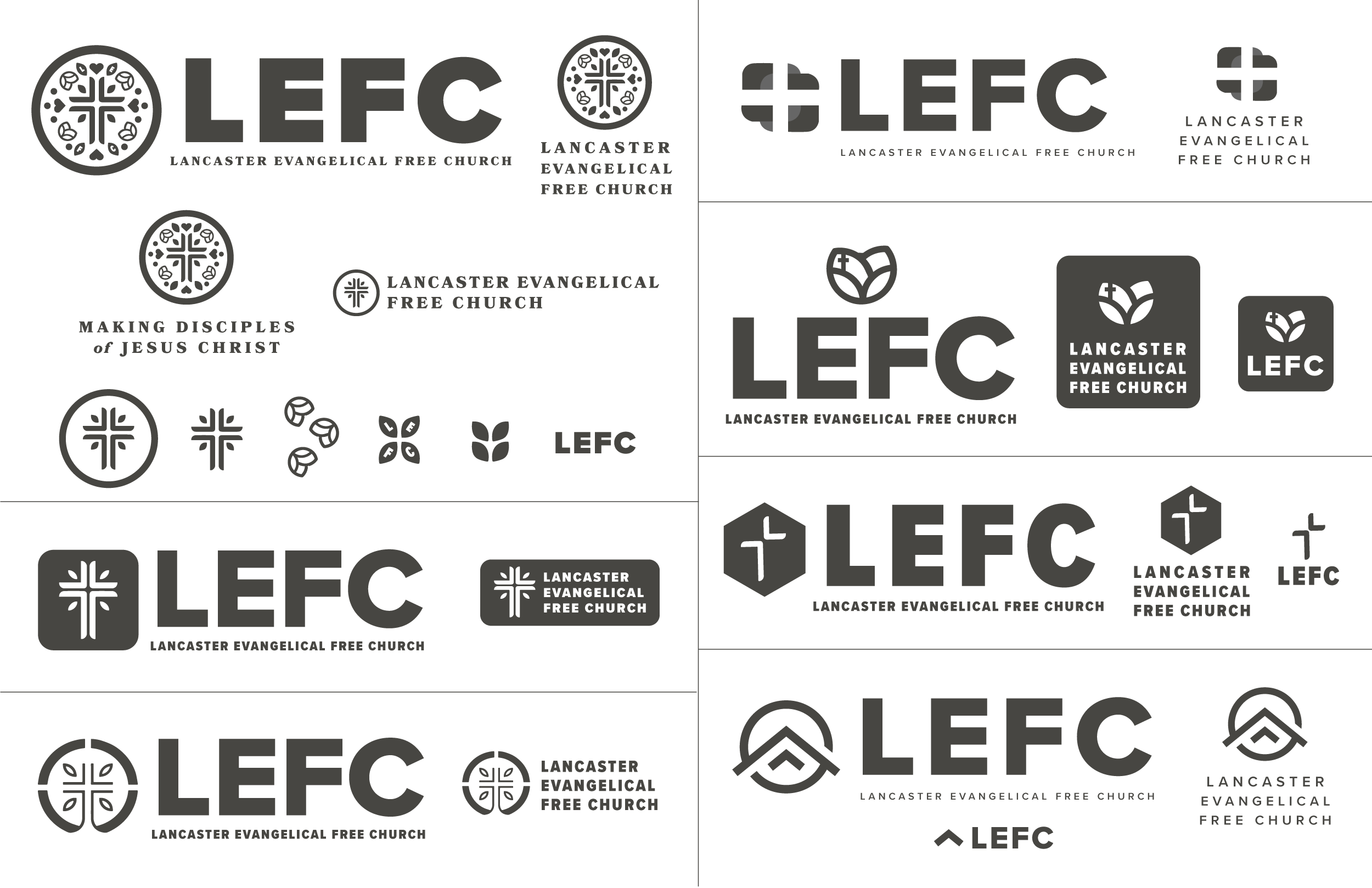
Rough Drafts
I always start with black and white drafts. I took the results from the questionnaire into account as well as our location in Lancaster County and presented these options to the leadership.
-
![]()
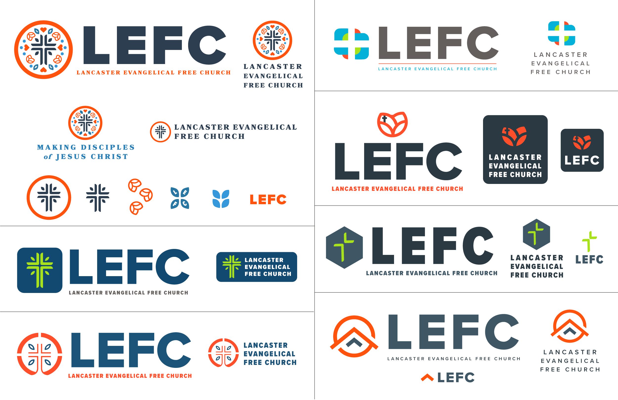
Rough Drafts Color
No one was ready to eliminate any of the options until I added color. At first we were thinking of just updating the orange and blue to a fresher look, so that’s the majority of what I tried.
-
![]()
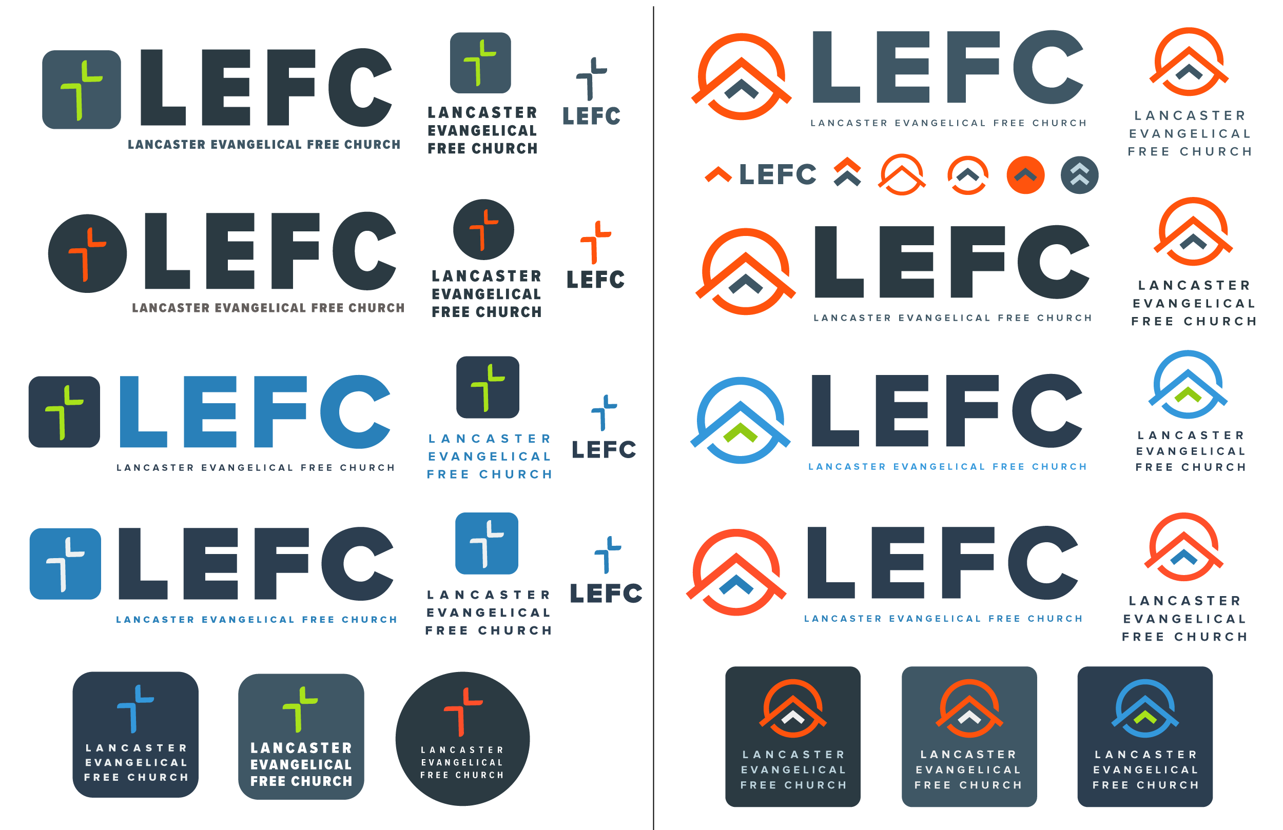
Narrowed Down Color Options
It came down to two general options, but leadership wanted to see slightly different typeface options, so I gave them variations and color variations as well.
-
![]()
Final Color Choices
We picked the type and logo, but were still undecided on color. They liked the updated orange and blue but decided they wanted to see an option that was in a totally different direction - something that felt more classic.
-
![]()
New Logo
The last minute addition color scheme won the day. It’s probably the latest in the process I’ve brought in a whole new direction for the color scheme, but I think it was the right call and this feels more like LEFC.


Implementation
-

Staff Apparel
There are certain events where it’s helpful for staff to be wearing branded t-shirts for easy identification.
-

Stationary
The church works with an outside printer for weekly bulletins, so I reached out to them to talk about custom letterhead and envelopes. I also had to design new business cards for the entire staff.
-

Building Signage
Since the rebrand coincided with a new building, I was able to work with a sign company to install branded signage all throughout the building, including stylized logos, wall directional signs, and room signs. We also designed a new monument sign for each driveway.
-
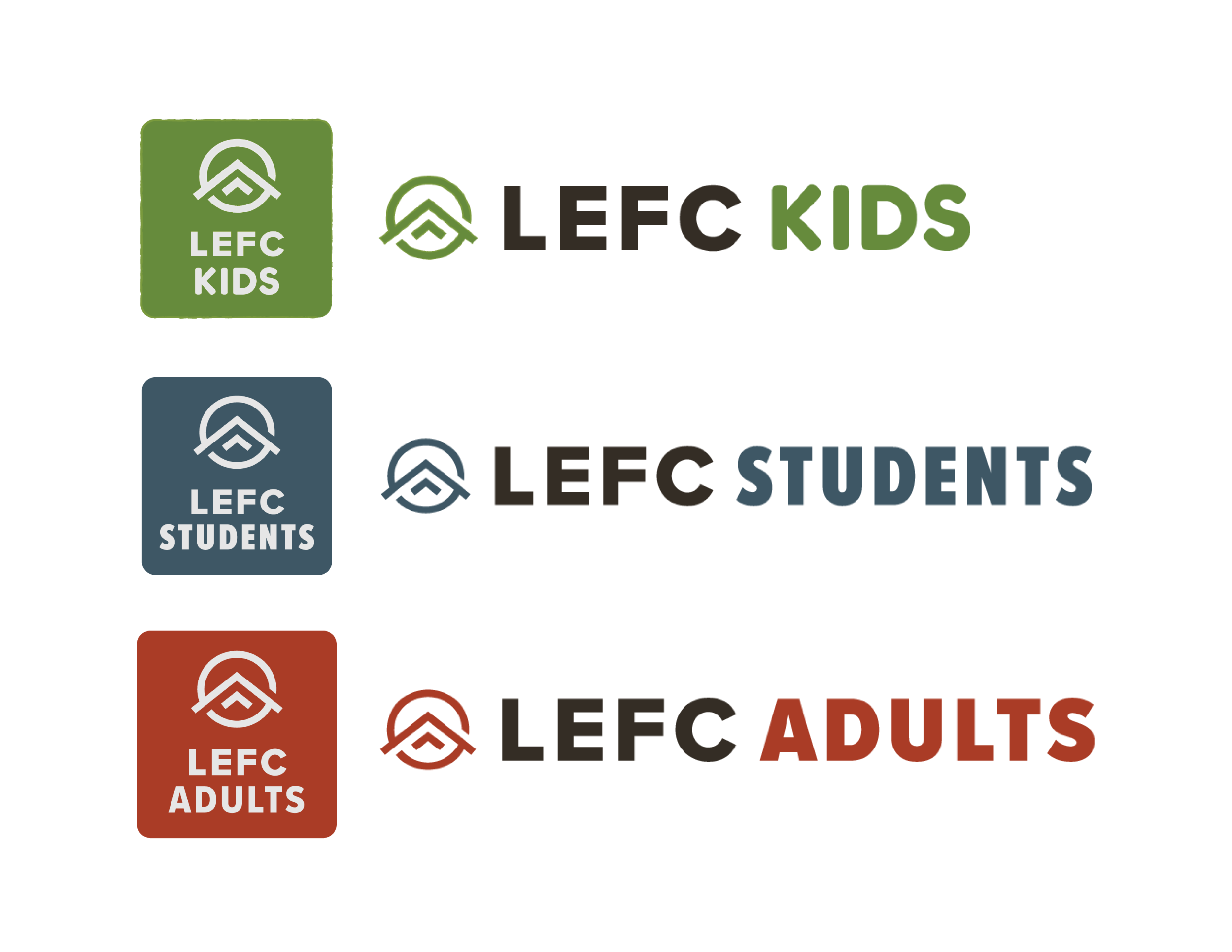
Sublogos
At the time of the rebrand, the various ministries weren’t uniform in name. We had Kids’ Ministry, Youth Ministry, and Adult Ministries. The rebrand felt like a good time to bring them all under the umbrella and call them LEFC Kids, LEFC Students, and LEFC Adults.

In addition to department sublogos, there are also various ministries within LEFC. I used the primary font family, Proxima Nova, for all logos and mostly kept to the brand colors. The youth ministry logos I kept more brightly colored and youthful. The high school and junior high ministry has been known as Crossover for years and they decided they wanted to keep that internal branding.
This doesn’t include every single thing I created for the new brand (brand guide, welcome folders and literature, website, etc), or old things I revamped to match the new branding, but it’s a comprehensive view. Normally when I do branding projects it’s for a small business - this was the widest reaching rebrand I’ve done by far. It was an excellent challenge and I’m still proud of the results.